


Rebranding for Naggura, a company specialized in the design of therapeutic beds for use in physiotherapy, beauty and health.
Naggura, a catalan company specialized in the design and manufacture of therapeutic beds, commissioned us to redesign their brand with the aim of updating the identity, graphic language and various visual elements for communication. A new website with a total redesign of its experience and usability was also proposed.

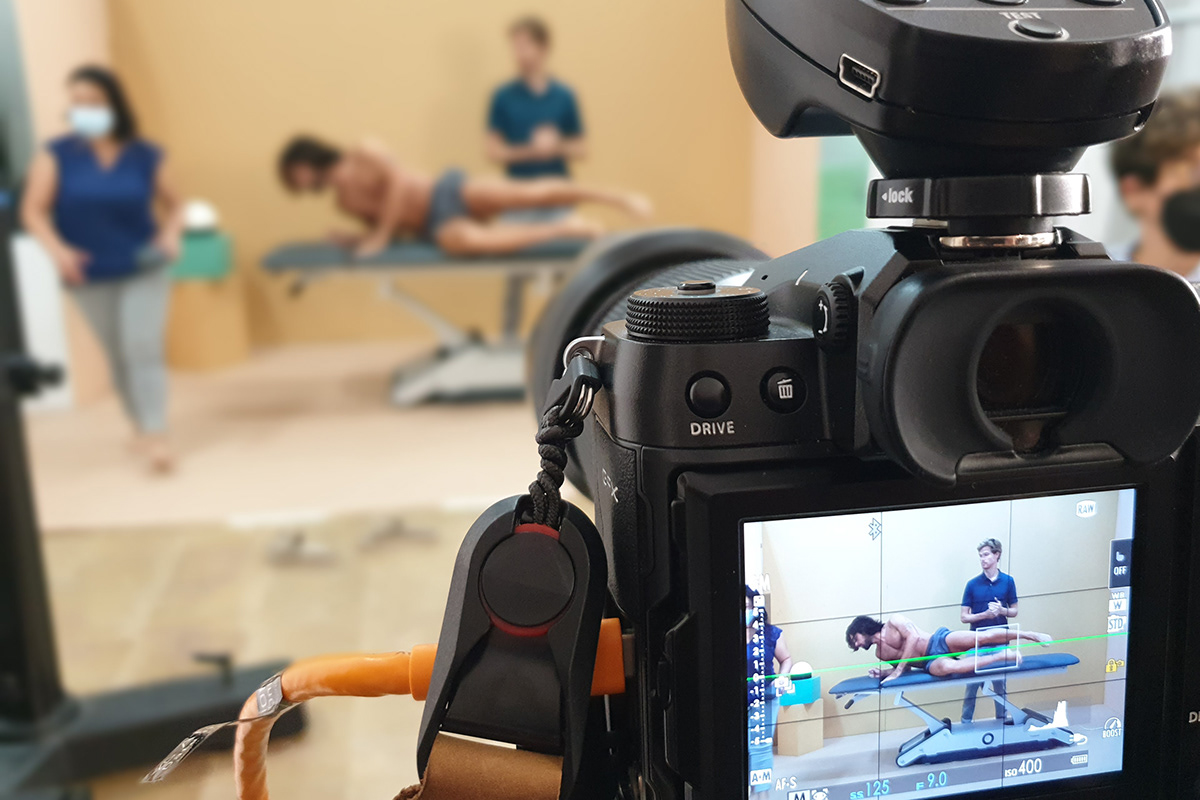
The project aims to enhance Naggura’s brand values and at the same time help to organize its brand architecture taking into account that new product lines are launched through several collections. In this regard, from Toormix we have coordinated the entire creative team to involve them in the development of the various visual elements needed: illustrations, renders, animations, product and user photographs, etc.

Process
Through several strategic brand workshops, the new values, mission and vision of Naggura have been defined. For the work of the new digital experience, several workshops have also been organized with the aim of defining both the usability and the experience in order to enhance the corporate discourse as well as the entire commercial strategy of the company.
The logotype
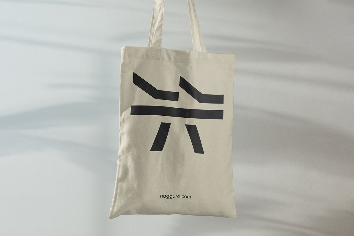
The connection with the oriental world is obvious in relation to the therapeutic practice and in relation to the name Naggura itself. The identity wants to reflect this idea and that is why the symbol picks up the formal heritage and turns the shape of hands and a bed into an abstract character inspired by oriental writing. The typographic part plays with lines and cuts that relates to the shape itself and with the finishes of the products in which the importance of details and design is emphasized.
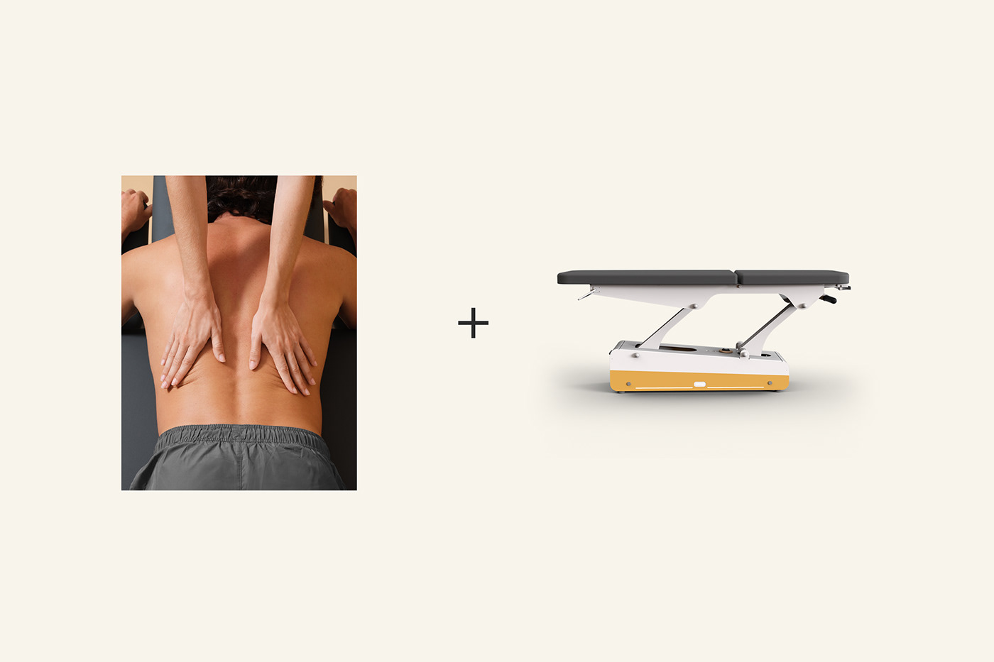


The graphic language facilitates the expression of a brand architecture that declines according to each product family and also thanks to the use of colors. The product photographs enhance the functionality of the beds, which at the same time are illustrated with professionals and patients using them.


To explain the various features of the product, virtual images of the beds and animations have been created to explain the different details, mechanisms and ergonomic movements of each one of them. As a creative campaign, artificial landscapes have been recreated to express the brand’s values in abstract scenarios in which the product is included in an organic and surprising way.


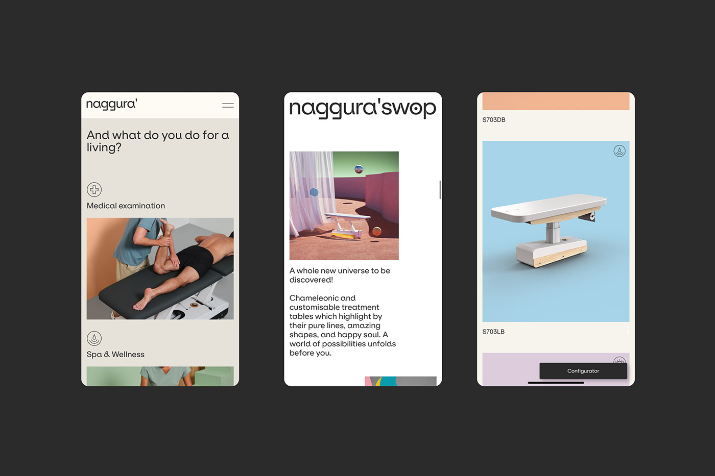
The website
The new digital experience has as its main objective a useful navigation separated by products and targets and where the various contact tools, the request for quotes and other technical aspects addressed to the different target audiences are enhanced. It is a dynamic website with many visual resources that allow to understand the products in an interactive way and explain even the technical details of each one of them.


Conclusion
It is therefore a global branding project in which, through a powerful identity redesign and a new graphic language, specialists in technical photography, renderings, animations and 3D resources have been involved in the production of the different elements that will be used in commercial, communication and digital elements. All this should allow Naggura to take a step forward in its expansion as a reference brand in the sector of therapeutic beds with a great emphasis on design and that should mark a direction in which and gradually incorporate new product lines following the new creative direction of the brand.
Client: Weelko
Services: Comunication, Brand strategy, Brand identity and Web design, UX/UI
Photography: Roc Canals
Developers: Jose Guadix + Xavier Vilella
CGI illustrations: Nachei
Render animations: Dani Ávila
Website: naggura.com


